Color is a powerful tool in web design, influencing how users perceive and interact with your website. The right color choices can enhance user experience, evoke emotions, and drive engagement. Understanding color theory and its impact on user perception and behavior is essential for creating an effective and appealing website. In this blog post, we’ll explore the principles of color theory and how strategic color choices can shape the success of your web design.
Color theory is the study of how colors interact and the effects they have on human perception. It encompasses the color wheel, color harmony, and the psychological impacts of colors. By understanding these concepts, web designers can create visually appealing and emotionally resonant designs.
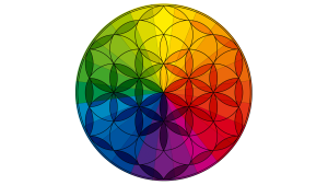
The color wheel is a circular diagram of colors arranged by their chromatic relationship. It includes:
Color harmony involves combining colors in a way that is aesthetically pleasing and creates balance. Some common harmonies include:
Colors evoke emotional responses and can influence user behavior. Here’s a look at how different colors impact perception and action:
Color is a fundamental aspect of brand identity. Choose colors that reflect your brand’s personality and values. Consistently use your brand colors across your website to reinforce recognition and build a cohesive brand image.
Use color to guide users through your website and highlight important elements. For instance, use contrasting colors for call-to-action buttons to make them stand out and encourage clicks. Ensure that your color choices enhance readability and accessibility, making it easy for users to navigate and interact with your site.
Align your color choices with the emotions you want to evoke. For example, if you’re designing a website for a spa, use calming colors like blue and green to create a tranquil atmosphere. For a tech startup, you might use bold, energetic colors like orange and yellow to convey innovation and enthusiasm.
Color can be used to establish a visual hierarchy, directing users’ attention to the most important elements. Use brighter or more saturated colors for key elements like headings and CTAs, while using softer or more neutral colors for background elements and secondary information.
Consider color accessibility to ensure that all users, including those with color vision deficiencies, can effectively use your website. Use sufficient contrast between text and background colors and avoid relying solely on color to convey important information.
Color theory plays a crucial role in web design, affecting how users perceive and interact with your website. By understanding the psychological impacts of different colors and applying them strategically, you can create a visually appealing, emotionally resonant, and highly effective website. Consistent and thoughtful color choices not only enhance user experience but also strengthen brand identity and drive engagement.
Color theory is important in website design because colors influence how visitors perceive a brand, navigate a website, and interact with content. Color is not just a decorative choice. It helps communicate emotions, create visual hierarchy, guide attention, and reinforce brand identity.
The right color choices can help a website feel:
A thoughtfully designed color palette helps create a website experience that feels intentional and aligned with a brand’s goals.
Color psychology explores how different colors can influence emotions, perceptions, and behaviors. While personal experiences and cultural differences affect how people interpret colors, strategic color choices can help reinforce the feelings a brand wants to create.
For example:
The key is not choosing a color because of a universal meaning. The key is choosing colors that support your brand message and audience expectations.
Colors can influence where visitors look, what they notice first, and how they feel while interacting with a website.
Strategic color use can help:
A website with thoughtful color choices feels easier to navigate because colors help guide users through the experience.
Choosing website colors should start with your brand strategy, not personal preference.
Consider:
A professional website color palette typically includes:
The goal is to create balance, consistency, and a clear visual identity.
Yes. Your website should feel like a natural extension of your overall brand.
Consistent colors across your:
help customers recognize and remember your business.
Strong branding creates familiarity, and familiarity builds trust.
Yes, color choices can influence how users interact with website elements such as buttons, forms, and calls-to-action. A well-designed color system can help draw attention to important actions and make the customer journey clearer.
For example:
However, color alone does not guarantee conversions. Great results come from combining color strategy with strong messaging, user experience, website structure, and compelling offers.
There is no single “best” button color that works for every website. The most effective CTA color is usually one that stands out from the surrounding design while still fitting the brand.
A good call-to-action button should:
For example, a luxury brand may use a refined accent color, while a playful brand may use something brighter and more energetic.
Most websites benefit from a focused color palette rather than using too many competing colors.
A balanced website often includes:
Too many colors can make a website feel cluttered and distract visitors from important information.
Color contrast is the difference between colors used for elements such as text, backgrounds, buttons, and graphics. Good contrast improves readability and makes websites easier to use.
Strong contrast helps:
Accessibility should always be considered when selecting website colors.
A beautiful website is not effective if visitors cannot easily read or interact with it.
Accessible color choices include:
For example, if a form error is only shown through a red color change, some users may miss that information. Pairing color with text or icons creates a better experience.
Yes. Poor color choices can create confusion or send the wrong message about your brand.
Examples include:
Your website communicates before visitors read a single word. Colors are part of that first impression.
Color is one of the strongest visual elements people associate with brands. Consistent use of colors helps customers recognize your business across different platforms.
Over time, a recognizable color palette can become part of your brand identity, helping customers quickly identify your:
A consistent visual experience strengthens brand memory.
Color itself is not a direct ranking factor for search engines. However, thoughtful color choices can improve user experience, which plays an important role in creating a successful website.
Better design choices can support:
SEO and website design work best together when the goal is creating a helpful experience for visitors.
Trends can provide inspiration, but businesses should not choose colors simply because they are popular.
A strong website color palette should be:
A trendy color choice may look great today but feel outdated quickly if it does not align with your brand identity.
Professional designers consider more than personal taste. They evaluate:
The best color palettes support the entire customer journey, from the first impression to the final action.
The biggest mistake is choosing colors based only on what the business owner likes.
Your favorite color may not communicate the right message to your audience. Website design decisions should always consider the customer first.
Effective color strategy balances:
Start by reviewing your current website and asking:
A thoughtful color update can refresh your website, strengthen your brand presence, and create a better experience for visitors.
Ready to harness the power of color in your web design? Contact us today to learn how we can help you create a visually stunning and impactful online presence.
If you enjoyed this article, please follow me on Facebook, Instagram, and LinkedIn. If you’d like to inquire about my services or work with me, please contact me using this form, and I’ll get back to you momentarily. I look forward to helping you Teal Your Story!
Sincerely,
Anna Teal